|
| City Arms |
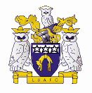
|
| 1936-1961 |
This badge was used on-and-off for the best part of fifty years, even before Leeds United were
formed but played as Leeds City. When it was not used, there was no decoration on the shirts. The badge is based on the City
of Leeds coat of arms, and indeed some versions show the same m otto as the City's - "pro rege et lege" (for the king and
the law). The badge went through several variations, sometimes in just two colours, sometimes more. This version dates from
around 1933.
_____________________________________________________________________________________________
| Owl |
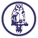
|
| 1965-1971 |
The 'owl' badge would seem to be more suitable to, say Sheffield Wednesday ('the
Owls') than to Leeds, but there are three owls on the City of Leeds crest, and this is where the logo came from. The badge
lasted for many years, but was usually not present on the away shirts which were often any old colour, even red! This badge
was supposedly ditched due to the superstitious Don Revie's belief that birds were bad luck.
_____________________________________________________________________________________________
| LUFC |
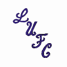
|
| 1971-1973 |
The cursive 'LUFC' script is considered by many to be the alltime classic Leeds
logo, and has made two re-appearances in later years, once on the 'retro-look' Asics shirts in the mid-90's and then with
the new club crest from 1998. Despite this it was actually only used originally for two seasons.
_____________________________________________________________________________________________
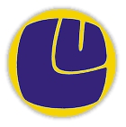
| Smiley |

|
| 1973-1976 |
The classic 'smiley' badge was a true seventies icon, made up of the letters 'L' and 'U' in the sort of bubble writing
that is very familiar on album sleeves etc. from that era. It arrived along with the new shirt manufacturer, Admiral. It was
used exclusively for three seasons, and then came back for two more spells on the away shirts later on.
_____________________________________________________________________________________________
| Inverted Smiley |
|
| 1976-77 |
The 'inverted smiley' was a strange development, not least because it shrank in size somewhat and was rotated through
45°. This was presumably to make it clearer that it really was the letters 'LU', but this destroyed the balance of the design,
and it later reverted to the original angle. It was used for a year on both home and away shirts, and then made a comeback
for another year on the away shirts later on.
________________________________________________________________________________________
| Text Wrap Smiley |
|
| 1977-1981 |
The original 'smiley' badge was obviously too confusing for some, so it got a border added containing the name of the
club. This badge survived for four years on the home shirts, but didn't feature on the away shirts.
___________________________________________________________________________________________
| Peacock |
|
| 1981-1984 |
With a new shirt manufacturer (Umbro) came a new badge, similar to the previous one, but with the 'smiley' replaced by
a stylised peacock, after the (now defunct) club nickname.
________________________________________________________________________________________
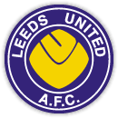
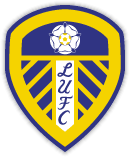
| Rose And Ball |
|
| 1984-1998 |
The 'rose and ball' badge was the longest lived Leeds crest in the modern era. The design neatly encapsulates what
the club is about, with the white rose of Yorkshire, the club's name, and a football forming the centre of the rose.
_____________________________________________________________________________________________
| Euro Sheild |
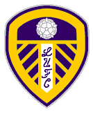
|
| 1998-1999 |
The next badge retained the white rose and saw a return of the curly 'LUFC' script from the seventies. The shield, and
the accompanying new strip had a definate 'european' look to them, in keeping with the club's adventures in the European competitions
at the time. _____________________________________________________________________________________________
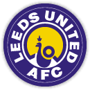
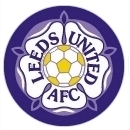
| Rose and Ball Shield |
|
| 1999-Present |
The 1999/2000 season saw the centre of the rose change to be a football, echoing the
previous 'rose and ball' badge. _____________________________________________________________________________________________
|